
Website Redesign- National Sleep Foundation

Team Member: Karen Wang, ChingYa Wang, Jingru Zhao
Overview
The objective of this project is to design a new mobile website for National Sleep Foundation (NSF). By analyzing their information architecture (IA), our team try to discover problems and existing advantages. We then would offer IA recommendations for the new interface. Ultimately, our redesigned mobile site will provide a better service with a more organized content structure for users who want to obtain related knowledge about sleep disorders and guidance on having a good quality sleep.
Type
Team Project
Skills
Information Architecture
Content Analysis
Sketching
Prototyping
Role
Content Strategist
UI Designer
Deliverable Consolidator
Duration
10 weeks
(Jan - Mar 2019)
Software

Challenges
During analysis, we realized that National Sleep Foundation(NSF) had a lot of useful content for people with sleep issues.
However, their Information Architecture (IA) had some problems:
1. Top level navigation hints little on included content, especially for "Sleep Topics" and "Journal."
2. Filtering for useful information was difficult since the content is all over the place and named unconventionally.

So we asked:
" How can we restructure the mobile IA to make information more accessible? "
We started with the process as below...
Process

PROJECT PROPOSAL
Domain
We all know some basic tips to improve our sleep quality, such as sleeping at the proper time, exercising regularly, avoiding drinks with caffeine, etc. However, it is hard to figure out a solution for poor sleep quality systematically. There are sites that you can easily find information about insomnia, but there isn’t a website that provides gradual steps and precise suggestions for you to follow. A helpful website offering structural information about insomnia symptoms and practical recommendations on other sleep issues will take on the role of a family doctor that can help people more effectively and instantly.
Potential Content
The proposed content was created based on the original articles on the NSF desktop site. We also looked at other similarsites that provide tips for improving sleep quality. Eventually, we came up with three main sections:
Sleep Disorders
e.g. sleepwalking, nightmares, insomnia
definitions and symptoms,
self-diagnosis quiz
Sleep & Health
how sleep affects health,
side effects of poor sleep,
physical importance of sleep
Remedies
home remedies,
lifestyle adjustments,
specific suggestions,
discussion board for users
Use Cases
We crafted two use cases based on interviews with potential users.


Focused Tasks
Two focused tasks were selected because they were more representative for our personas:
• Browsing causes for nightmares
• Seeking information on how to do sleep meditation.
We turned both tasks into flowcharts to better understand how users interact with our site.

In this section we included details on how we involved users in our redesign
process through various methods: Card Sort, Treejack, and Chalkmark.
Content Inventory
We did content inventory before diving into Card Sort. This way, we could understand existing content better. We simply crawled all content on the site that might be relevant to our proposal. This yielded 200+ items. To eliminate unnecessary content, we compared this list to our list of potential content proposed for this site. After clean-up, we ended up with 123 cards.

Initial content was all over the place and named inconsistently.
CARD SORT

After cleaning up, 123 relevant cards were created.
Pilot Card Sortings
With these 123 cards, we ran a pilot hybrid Card Sorting and discovered some issues:
• Over 100 items was overwhelming.
• It could be hard to read card descriptions when there were so many.
• Many contents were still unnecessarily detailed.

Descriptions getting overwhelming.

Only keep “sleep talking” as a representative card for all sleep talking content.
Based on these, we trimmed the cards further by grouping and getting rid of the descriptions. After the edits, we brought the card number down to 76 and another pilot hybrid Card Sorting was conducted. We had more agreements within the team.
Card Sort One

“Less cards! There are a lot of cards so quite a long exercise, seems like there could be overlap of categories as well."
The result was not what we expected. Almost all categories had agreement rate under 60%. Our participants pointed out the issues for us:
There were also issues on conveying the meaning of the cards. We were afraid to change the cards from the original page title. The Card Sort showed us that unless we change the cards to show the actual content of the page, participants won’t be able to sort it properly.
"More than a dozen of the items had the word 'disorder' in them - One or two representative cards with the word “disorder” could be enough for sorting."
Keep Trimming
Based on the feedback, we started to trim these cards even more by removing redundancy and grouping. Renaming was done as well to clearly show that page’s content vs. arbitrarily listing the original page title. We also combined “remedies” and “treatments” as one category since many people showed confusion distinguishing those two.

Renaming long titles into easy to understand categories.
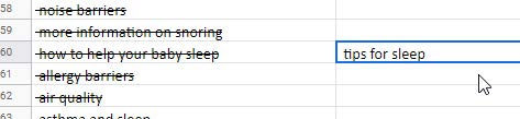
Grouping similar contents into “tips for sleep”.
Card Sort Two
After all the above effort, we finally reduced the card number to 24. We launched another hybrid Card Sorting, Card Sort Two. Initially, the results did not seem successful since the agreement rate was still very low (four out of five are under 40%). Then we analyzed the standardization grid and realized that there were only four cards that actually had issues.
We learned that the standardization grid is a better tool for result analysis since:
• It showed more details on how each participant sorted the card.
• The problem was easier to identify given the shade of the blue (lighter means more diffused sorting).

Only Four cards showed lighter blue among all cards.
SITEMAP
Starting sitemap and wires at this point helped us keep the project deadlines. It also helped us to get our head into the design space. Once we collect the results from Treejack, we can iterate the sitemap and wires.
Sitemap Draft
We kept Card Sort categories as level one navigations. Cards that were summaries or representatives of actual content were expanded back into their original content, based on the cleaned-up content inventory before the Card Sort. Things that were deeper than three levels of information architecture were compiled into the little stack icon.


WIREFLOWS
Wireframe Sketches
Our team created sketched wireframes based on focused task flows as well as the sitemap above.


Wireframe Task Flows

Task: Identify causes for nightmares.
Treejack Test
At the same time of designing, we began to verify the Information Architecture (IA) that we established from card sort two through IA testing, i.e. Treejack.

From the two rounds of Treejack test, we found that the first round test having a low success rate was mainly due to unclear scenario descriptions. The success rate for each task improved over 80% after clarifying the test scenarios and expanding the correct answers.
In conclusion, Treejack Test didn't have much influence on our redesign process. Our potential users could target the information quite successfully based on the sitemap draft we created at first.
Lo-fi to Mid-fi Wireframes
We also modified our wireframes from low fidelity to mid fidelity for Chalkmark test afterwards.


Chalkmark Test
Testing on the visuals were necessary to design functionality. We decided to run Chalkmark tests on our mid-fi wires to see how well potential users can receive them.

Results
We did three rounds of Chalkmark tests, but the success rate was still low. After adding questionnaires for tests two and three to understand participants' thoughts, we realized that in real life, people did not think much when they clicked. In real life, people can go back anytime, but not the case during a Chalkmark test. It's fine that we had a lower success rate on Chalkmark. Most importantly was for us to know why they clicked on a specific icon or text and offered a better design option to lead them to the right destination.
Design Iteration
After analyzing participants' intention, we made design changes as below,


Change 1 Eliminating blue text that looked like clickable links.
Change 2 Adding category descriptions to distinguish "meditation" further from "medication".

Change 3 Enhancing the interface to clarify what "jump to" and "other disorders" do on the slide-out menu.
Lessons We Learned
OVERALL
Proposal could change sometimes. Be flexible.
We also encountered an unexpected situation where NSF updated their site four days before we started content inventory. All these could not be avoided ahead of time when the proposal was written, so being flexible to changes was the only solution.
Test scenario writing was important.
Both in Treejack and Chalkmark, poorly written scenarios had caused us a low success rate on tested tasks.
CARD SORT
Standardization grid provides better analysis.
During Card Sort Two, if we had looked at the agreement rate, we would never stop testing. However, the standardization grid showed clearly how each card got sorted, which was much more helpful in terms of
pin-pointing problematic cards.
Start design once you have solid Card Sort results, then iterate along with more research.
We could have waited for the Treejack results, however, starting design once we had a solid Card Sort allowed us to think visually early on. It also prevented us from getting into endless testing.
TREEJACK
Sometime you would need to expand the correct answer.
During Treejack two, the initial test result was not high enough. However, after looking at the nominated right answers by participants, we realized that there were one more correct option that we ignored at the beginning.
It's important to analyze the indirect successes.
It's okay to include indirect successes. However, remember to analyze their paths, since participants' detours would reveal potential IA issues too.
CHALKMARK
Result may not be helpful unless you ask participants why they made the choice.
In Chalkmark One, participants were not required to take a questionnaire, so we had no idea why they would choose an option different from the correct answer. It was hard to determine what should we change for Chalkmark Two.
Chalkmark success rate can be lower since in real life, people often click wrong and come back.
After three rounds of Chalkmark, our task success rates still weren't perfect. We thought this could be a natural disadvantage of Chalkmark since in real life, users tend to click to explore.